reading-notes
Forms and JS Events
FORMS
- How to collect information from visitors
- Different kinds of form controls
- New HTML5 form controls
Why Forms?
-
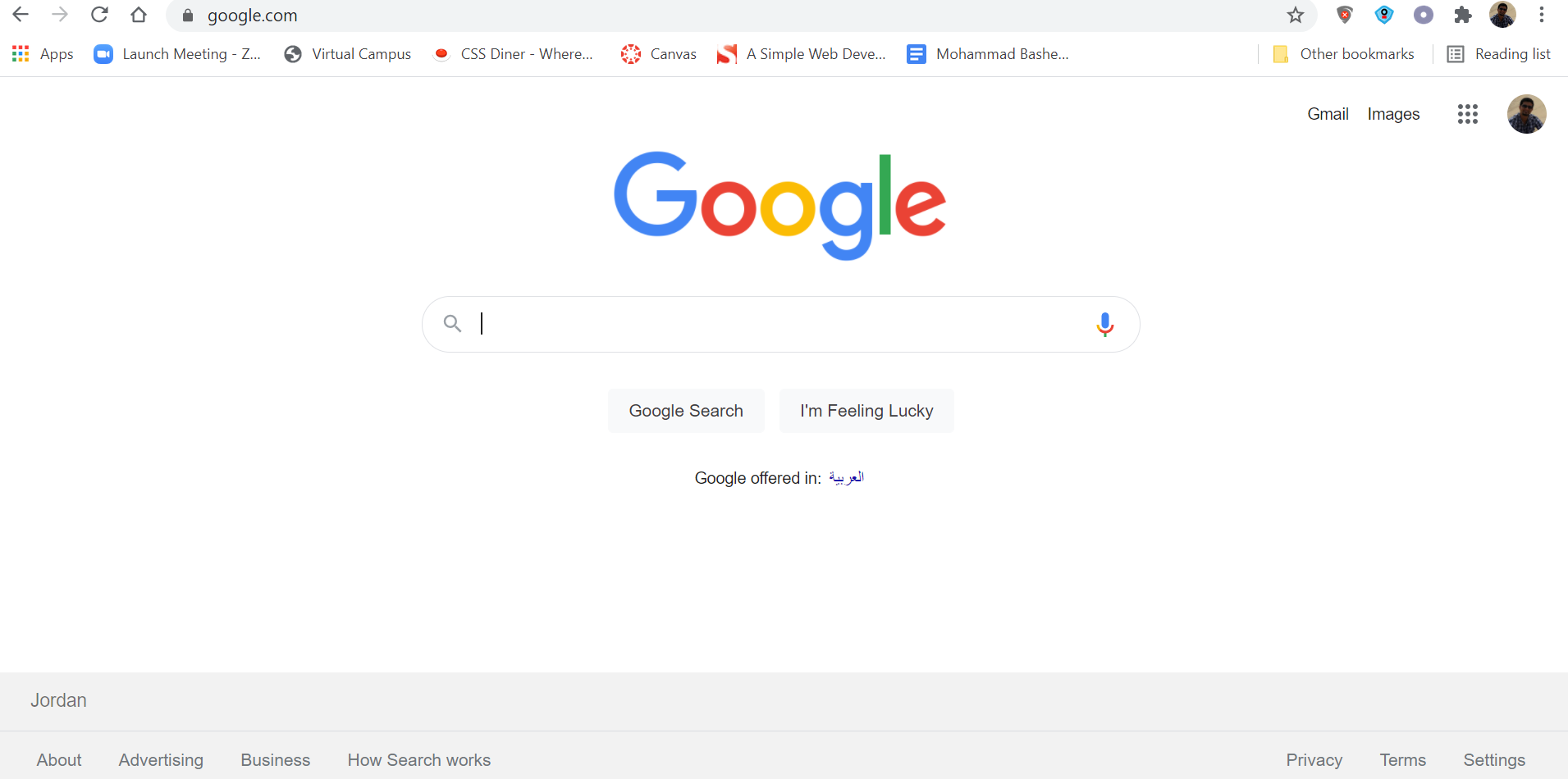
The best known form on the web is probably the search box that sits right in the middle of Google’s homepage.
Form Structure
<form>
Form controls live inside a
<form>element. This element should always carry the action attribute and will usually have a method and id attribute too.
action
Every
<form>element requires an action attribute. Its value is the URL for the page on the server that will receive the information in the form when it is submitted.
method
Forms can be sent using one
Text Input
<input>
The
<input>element is used to create several different form controls. The value of the type attribute determines what kind of input they will be creating.
type="text"
When the type attribute has a value of text, it creates a singleline text input.
name
When users enter information into a form, the server needs to know which form control each piece of data was entered into.
Password Input
<input>
type="password"
When the type attribute has a value of password it creates a text box that acts just like a single-line text input, except the characters are blocked out. They are hidden in this way so that if someone is looking over the user’s shoulder, they cannot see sensitive data such as passwords.
name
The name attribute indicates the name of the password input, which is sent to the server with the password the user enters.
size, maxlength
It can also carry the size and maxlength attributes like the the single-line text input.
Text Area
<textarea>
The
<textarea>element is used to create a mutli-line text input. Unlike other input elements this is not an empty element. It should therefore have an opening and a closing tag.
Radio Button
<input>
type="radio"
Radio buttons allow users to pick just one of a number of options.
name
The name attribute is sent to the server with the value of the option the user selects. When a question provides users with options for answers in the form of radio buttons, the value of the name attribute should be the same for all of the radio buttons used to answer that question.
value
The value attribute indicates the value that is sent to the server for the selected option. The value of each of the buttons in a group should be different (so that the server knows which option the user has selected).
checked
The checked attribute can be used to indicate which value (if any) should be selected when the page loads. The value of this attribute is checked.
Check Box
<input>
type="checkbox"
Checkboxes allow users to select (and unselect) one or more options in answer to a question. name The name attribute is sent to the server with the value of the option(s) the user selects. When a question provides users with options for answers in the form of checkboxes, the value of the name attribute should be the same for all of the buttons that answer that question.
value
The value attribute indicates the value sent to the server if this checkbox is checked.
checked
The checked attribute indicates that this box should be checked when the page loads. If used, its value should be checked
Drop Down List Box
<select>
A drop down list box (also known as a select box) allows users to select one option from a drop down list.
The
<select>element is used to create a drop down list box. It contains two or more<option>elements.
name
The name attribute indicates the name of the form control being sent to the server, along with the value the user selected.
<option>
The
<option>element is used to specify the options that the user can select from. The words between the opening<option>and closing</option>tags will be shown to the user in the drop down box.
value
The
<option>element uses the value attribute to indicate the value that is sent to the server along with the name of the control if this option is selected
Multiple Select Box
<select>
size
You can turn a drop down select box into a box that shows more than one option by adding the size attribute. Its value should be the number of options you want to show at once. In the example you can see that three of the four options are shown.
multiple
You can allow users to select multiple options from this list by adding the multiple attribute with a value of multiple.
File Input Box
<input>
If you want to allow users to upload a file (for example an image, video, mp3, or a PDF), you will need to use a file input box.
type="file"
This type of input creates a box that looks like a text input followed by a browse button. When the user clicks on the browse button, a window opens up that allows them to select a file from their computer to be uploaded to the website.
Submot Button
<input>
type="submit"
The submit button is used to send a form to the server.
name
It can use a name attribute but it does not need to have one.
value
The value attribute is used to control the text that appears on a button. It is a good idea to specify the words you want to appear on a button because the default value of buttons on some browsers is ‘Submit query’ and this might not be appropriate for all kinds of form.
Image Button
<input>
type="image"
If you want to use an image for the submit button, you can give the type attribute a value of image. The src, width, height, and alt attributes work just like they do when used with the
<img>element.
Button & Hidden Controls
<button>
The
<button>element was introduced to allow users more control over how their buttons appear, and to allow other elements to appear inside the button.
This means that you can combine text and images between the opening
<button>tag and closing</button>tag.
<input>
type="hidden"
This example also shows a hidden form control. These form controls are not shown on the page (although you can see them if you use the View Source option in the browser).
Labelling Form Controls
<label>
When introducing form controls, the code was kept simple by indicating the purpose of each one in text next to it. However, each form control should have its own
<label>element as this makes the form accessible to vision-impaired users.
The <label> element can be used in two ways. It can:
-
Wrap around both the text description and the form input
-
Be kept separate from the form control and use the for attribute to indicate which form ontrol it is a label for.
Grouping Form Elements
<fieldset>
You can group related form controls together inside the
<fieldset>element. This is particularly helpful for longer forms.
Most browsers will show the fieldset with a line around the edge to show how they are related. The appearance of these lines can be adjusted using CSS.
<legend>
The
<legend>element can come directly after the opening<fieldset>tag and contains a caption which helps identify the purpose of that group of form controls.
HTML 5: Date Input
type="date"
If you are asking the user for a date, you can use an
<input>element and give the type attribute a value of date. This will create a date input in browsers that support the new HMTL5 input types
HTML 5: Email & URL Input
type="email"
If you ask a user for an email address, you can use the email input. Browsers that support HTML5 validation will check that the user has provided information in the correct format of an email address
type="url"
A URL input can be used when you are asking a user for a web page address. Browsers that support HTML5 validation will check that the user has provided information in the format of a URL.
HTML 5: Email Search Input
type="search"
If you want to create a single line text box for search queries, HTML5 provides a special search input
Lists, Tables and Forms
- Specifying bullet point styles
- Adding borders and backgrounds to tables
- Changing the appearance of form elements
Summary
LISTS , TAB LES AND FORMS
-
List markers can be given different appearances using the list-style-type and list-style image properties.
-
Table cells can have different borders and spacing in different browsers, but there are properties you can use to control them and make them more consistent.
-
Forms are easier to use if the form controls are vertically aligned using CSS.
-
Forms benefit from styles that make them feel more interactive.